Insight:
The OCBC REWARDS Card is a rebrand of the former OCBC Titanium Card. It was renamed to make its benefits clearer and more instantly recognisable to consumers. In a market where most credit cards sound the same and offer similar perks, standing out takes more than a new look. To break through, the reintroduction had to be fresh, bold and unexpected. Something that would capture attention without relying on the usual credit card clichés.
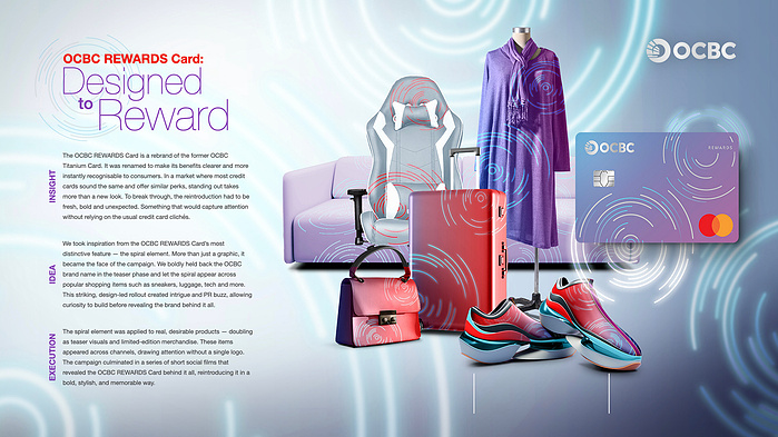
Idea:
We took inspiration from the OCBC REWARDS Card’s most distinctive feature — the spiral element. More than just a graphic, it became the face of the campaign. We boldly held back the OCBC brand name in the teaser phase and let the spiral appear across popular shopping items such as sneakers, luggage, tech and more. This striking, design-led rollout created intrigue and PR buzz, allowing curiosity to build before revealing the brand behind it all.
Execution:
The spiral element was applied to real, desirable products — doubling as teaser visuals and limited-edition merchandise. These items appeared across channels, drawing attention without a single logo. The campaign culminated in a series of short social films that revealed the OCBC REWARDS Card behind it all, reintroducing it in a bold, stylish, and memorable way.